Fall 2019 CO-OP
I learned a lot during my time at my internship. I learned a lot of skills and I learned the production side of the business. I got multiple tasks per week to create new designs, and I also had to recreate some designs. Logos whose digital files were lost I had to recreate, designs for tickets or post cards I had to recreate, and sometimes whole t-shirt designs I had to manually retrace. I also, rarely, had to scan in many documents or photographs for clients to digitize, recolor, or edit. Below, shows the things that I learned and projects that I worked on by myself.
Week 1
Week 1 was mostly an introduction week. I worked on a few mini projects, but mostly I was learning how things around the office worked. My boss took my on a tour of all of the different machinery, like the screen printing press, embroidery machine, vinyl cutter, and all of the different printers they had. When working on a few little projects, I began learning new skills and key short cuts my boss was showing me. My First project was recreating tickets for a township near by. I had to measure out, copy text, and replace old information with new information on the front and back of three different tickets. Here is where I learned a new skill that I had never seen before.
Most of my work that was to be completed would be done in Indesign. The only exceptions were when I was editing photographs in photoshop, or illustrating in illustrator. My boss was very clear that Indesign pages would be the only acceptable form of files on projects that required any text or were to be printed on paper. (vinyl excluded)
When printing a specific number of tickets, each ticket needs to be numbered. Whether they are seat numbers or just number tickets for limited space available with a maximum number of people, each ticket gets a unique number. Instead of inputting them manually, there is a way to do it much more efficiently. By creating a spread on Excel, you input numbers starting from one, down to whatever number you will need. Each row gets a unique number, by starting at one, two, three, you can then highlight them and drag your your mouse down to the number of rows you will need. Excel will automatically input the rest of your numbers, yet again saving you more time. Once there you go into Indesign, select the paragraph box you want the numbers to go into and input the file. This will ensure that once printed, each ticket will have the correct unique number it was assigned.
Week 2-4
Week 2 through 4 were very long weeks, as I was working on the same sports year book each day of these weeks. Bergen Catholic High School, is an all male, private college preparatory school located in Bergen County of New Jersey. As this was a private school, I am unable to share the book I had created during this time at work. The school required my boss to keep the yearbook private, as personal ads, facts, and photographs of students were inside.
However, I can tell you everything I had done and learned while working on this book. It was a book that was over 250 pages long. I had to design and flow each page, design the front cover, and do many different conversions. At the beginning of the book were different full page ads that were going to be printed in full color. Next were pages of information that needed to be designed and placed. There were a teachers' page, coaches page, roster lists, an appreciation page for hands on parents, an administrative faculty page, and more. Different letters of appreciation and good fortunes from the Principal and Administrative President were sent in and each page needed to be designed and the text reformatted. Each page needed its proper information with a clean and cohesive design. After those pages were complete, sports schedules needed their own pages. Information about which sports team, location and time of game, and opponent were needed. Next came the photographs and player bios of all varsity teams. Each photograph and bio was sent in an email, and I had drop each image in its proper numerical order and convert them to black and white through indesign connected to photoshop. I was also responsible for the reformatting of each bio to be cohesive across the book. Once those were complete I had to convert to grayscale and drop in all team and coach photos.
After that, Indesign needed to be labeled under pages, which pages here on after were to be printed on silver paper, gold paper, and which page had what upcoming format, this way when being sent away to be printed and bonded, the printing press will know when each starts. The gold pages were of high paying advertisements. Each advertisement had to be converted to grayscale and flown through out the pages. Some advertisements were already PDF documents, but many were sent as word documents, acrobat documents, and more, all of which had to be re-saved as PDFs. In each section of advertisements they had to be placed in alphabetical order based off of the business's name and off of the player's last name, this way they could be found easily for those reading them. Many of the gold advertisements were from local and some national businesses and companies. Some were from family and friends that were personalized messages to any players participating in sports this year. The same problems or issues that were seen in the gold pages were true for the silver pages.
Next came the half page ads that were printed on white paper. All of these advertisements and messages to the players all needed to be reformatted, resized, converted to grayscale, and/or redesigned to the correct orientation. This is where my boss taught me the keyboard shortcut, Option + Command + Shift + E, which will make the file center-fit into the box that was created to fit in the desired location and size. I also learned the keyboard shortcut Command + Option + Shift + V, Which was paste into place. This came in handy when using the frame tool over and over for each advertisement.
I then began working on the quarter page ads and the business card ad pages. These pages showed the same problems and solutions as the half page advertisements. I did learn another keyboard short cut to see if files were the correct size/format before importing them into their proper locations. Selecting the file with one click, then pressing the spacebar, will open the file in preview giving you the ability to see it full size to notice any problems or issues.
After all of the grayscale advertisement pages were completed, the final color full page ads needed to be placed. They had to go in a specific order according to the room parents responsible for creating the book. After they were completed, I also had to design the back cover, which would be shown in full color like the front cover.
After the sports year book was done, I was able to create three different lawn signs the students, teachers, and parents were able to choose from to show their support for the school. Two of the designs were able to be customized with the students last name and uniform number for family and friends to post on their lawns in support of them. About 40 different customizable signs were chosen, therefore I had to input the proper information for each sign.
Week 5
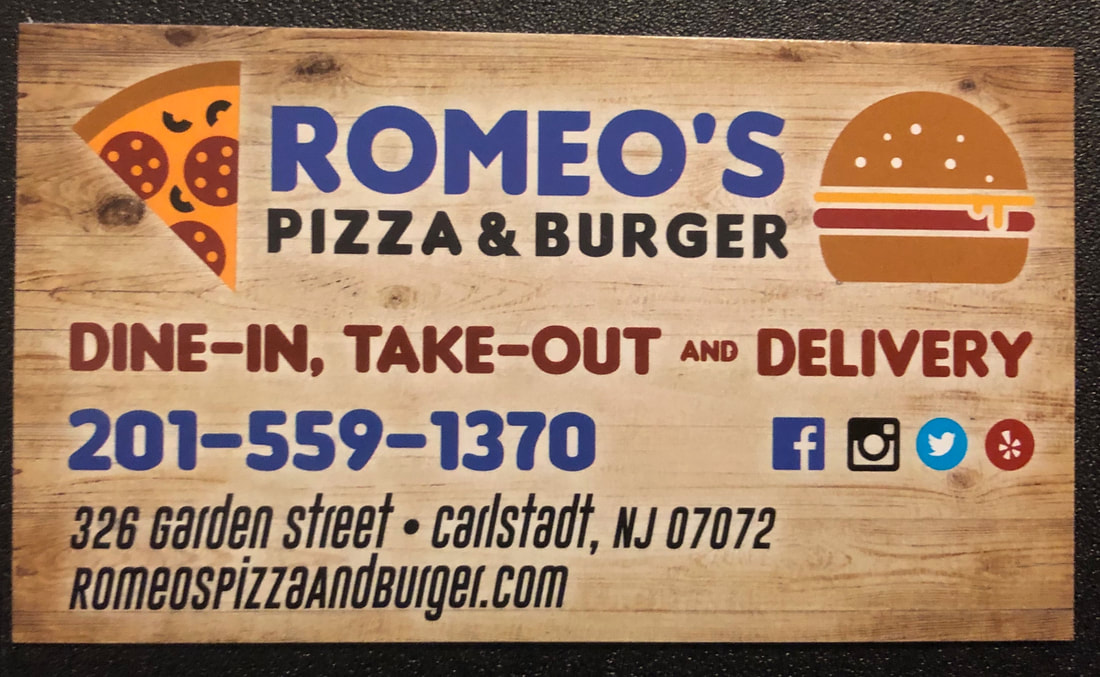
I created a menu for Romeo's Pizza and Burger, modeled after their logo, as well as, designed a one sided business card to match. I created three designs for each one, and then the client got to pick which they preferred. In the end, after going back and forth on minor details twice, I created a final product that was immediately sent to production to be printed.
I used the same display font for the menu and business card that was used in the logo, because I wanted there to be a noticeable cohesion, and not to create unnecessary distraction. I liked the idea of using a woodgrain as the background for the menu and business card. It was a nice way of adding dimension to the menu since the logo that was created for them is very two dimensional. The Client responded greatly to this idea as well, ad this was the design direction we chose to go further with. These are the final designs that I have physical copies of.
I used the same display font for the menu and business card that was used in the logo, because I wanted there to be a noticeable cohesion, and not to create unnecessary distraction. I liked the idea of using a woodgrain as the background for the menu and business card. It was a nice way of adding dimension to the menu since the logo that was created for them is very two dimensional. The Client responded greatly to this idea as well, ad this was the design direction we chose to go further with. These are the final designs that I have physical copies of.
Menu


Business Card
Week 6
Week 6, I learned a lot more specifics on each machine, as this was a very busy week for production. There was a client that needed NCR prints made for their business. I learned that NCR stands for Non-Carbon Reproduction, which is the paper receipts mechanics often use. They are the yellow, pink, and white transfer paper forms that when filled out, the papers underneath get the information transferred onto them, saving time by not having to make copies for both parties. The term welding in the office was something I had not heard before, but that means using pathfinder to merge two images or vectors together. I am very familiar with pathfinder, I was just new to the technical vocabulary used in the field. Vinyl cutting is very interesting. I was shown the machines in week one and explained how they worked and how to design for them, but this time I was able to see it in action. Once cut, you much peel off the excess from right to left. Then you must transfer it onto transfer tape, which allows you to place it on the cars, windows, etc. You have to place it from the center outwards, which is also how you smooth out the air bubbles. There are also two types of vinyl printing. There is the kind that goes onto fabric which gets printed mirrored, and then there is the vinyl that gets placed onto cars and windows which is the kind that gets put onto the transfer paper and that is printed regularly.
Project wise, I got to work on quite a few things. First, I got to design a two sided three color business card for the company Blue Line Beast. It is a company that supports police officers, they sell merchandise and hold/participate in many events to raise awareness to ensure proper training, exercise, diet, and good police practices under the law.
Project wise, I got to work on quite a few things. First, I got to design a two sided three color business card for the company Blue Line Beast. It is a company that supports police officers, they sell merchandise and hold/participate in many events to raise awareness to ensure proper training, exercise, diet, and good police practices under the law.


I also created a business card to the exact specifications of a client. They came in with a sketch and they knew exactly what they wanted and how they wanted it. There was not much room for creative ideas or any type of freedom, but I was able to show a few slightly different concepts. The customer knew what he wanted image wise, color wise and layout of the images. I was really only able to decide on the typeface and it's location, saturation and particular hue of the yellow and blue, and the images chosen.


I was also chosen to work with a client on a logo design. She was a slightly difficult client, as she did not know exactly what she wanted, but she knew what she did not want. She wanted the letter "E" to be shown with flowers, foliage, and butterflies all in one logo. She provided reference images, that were not logo designs. They were art pieces, images painted or drawn, with many intricate concepts and parts to them. She provided 2 color schemes that she was unwilling to stray far from. One was most greens with pops of color, and the other was all pink and orange hues. So I drew out a lot of different ideas and concepts, and free handed almost everything. This is the first draft of logos I sent to the client. I provided completely different ideas to try to help her narrow down her imagination. With each design, I switched up the sizes, colors, and orientations, helping to have her be able to see an even wider range in possibilities so she could pick and choose.


Week 7
This week I was given more projects, and would continue working on others. I learned some more keyboard short cuts as well. First was Command + L, for rotating anything left without using the grab holds on the corners. The second was making Bullets by pressing Option + 8. This comes in handy when creating menus or large documents.
I created more logos for the woman with the "E" logo. She figured out that what she wanted could not be done. Having that intricate of a logo at a small size on a business card did not look right. She gave me more reference images that were much more simplistic for me to go off of. I again gave the client different logo designs both with different color combinations, and possible orientations of elements.
I created more logos for the woman with the "E" logo. She figured out that what she wanted could not be done. Having that intricate of a logo at a small size on a business card did not look right. She gave me more reference images that were much more simplistic for me to go off of. I again gave the client different logo designs both with different color combinations, and possible orientations of elements.


I created a confidential document for an electric company in upstate New York. This company inquired confidentiality as it contained new protocols, fees, and other information. The document that I created was a contract with all stipulations that go into "terms of use" documents. I was in charge of creating the document, formatting it, designing it, etc. The written elements were emailed but it was entirely up to me to design the layout. My only rule given was that the document was to be in a sans serif font, due to the fact that sans serif is more difficult to read than serif when put into large word heavy documents. This 30 page document took up most of my week at the agency.
Week 8
This week I was given more creative projects to design. I was given the task to design a logo and business card for an import and export company. The client's only request was that the logo be a white tiger, as that was their name. They gave one picture for a frame of reference, and I was able to do the rest. I designed the tiger based off of the photograph that they provided us. That was the main frame of reference and the only thing they said they needed, so I ran with it. Here are the logo designs.


Then I was given the task to create a flyer that would be emailed out, posted on one location's door, and on their website. The client wanted to have their logo at the top of the page. Their logo was more than what I put on the flyer. It had a background of dots behind it in three different shades of cream. I decided to take it out, because it was a bit too distracting. My design is consistent across the board of designs that I gave them. I played around with the layout and the layout show was the best for a vertical design. I played around a lot with colors, typefaces, and sizes. I also modeled the designs off of their website which is quite similar to the black design.


The Last project I was able to work on during this week was creating a menu flyer that would be mailed out to everyone in the town. On the front, the client wanted Thanksgiving themed photographs. This flyer was meant for holiday catering, therefore he wanted to keep it in theme. I decided to use the colors in the logo itself for inspiration. I created grid and used different shades of the colors in the logo to create a festive flyer. For the side with the menu, he wanted it to scream Italian. So I suggested each column be the flag of Italy, which he loved. Then, I had to design the layout of the menu itself. I chose typefaces, figured out how I wanted to organize it, and chose all of the type setting options. This went back and forth to the client about two times before final completion, as one of the photos on the front was changes from pumpkin pie to cannolis.


Week 9
I created two things for one client, and then another separate project for Wood-Ridge Township. The first two projects were menus that needed to be converted into window graphics. I had to recreate the logo for the restaurant as they lost all existing files of their art work. The first one was the restaurant menu for the catering any holiday events, this one was simple and very text heavy. I used color to help separate the text up making it easier to read. I used black lettering for most of the text, with red and green as accent colors. I had to divide up the menu in a way that made sense and fit in the size of the window. I thought that the usage of different typefaces and sizes would help as well. The design with the black background was only to show that the lettering on the window would be in the color white. Here are the three concepts I gave the client.


This design was for a separate window. The menu was to show their sandwich selection as it is very extensive. They originally had only text, like the ones shown above. After showing my designs to the client, they decided that they wanted pictures to be placed in the window as well. The photos used were of my choosing and the placement was added at the bottom, causing minimal disruption to the menu itself, along with this is a window graphic and not a physical menu in hand printed on paper. Just like the design above, the design with a black background was to show the client the lettering in white.


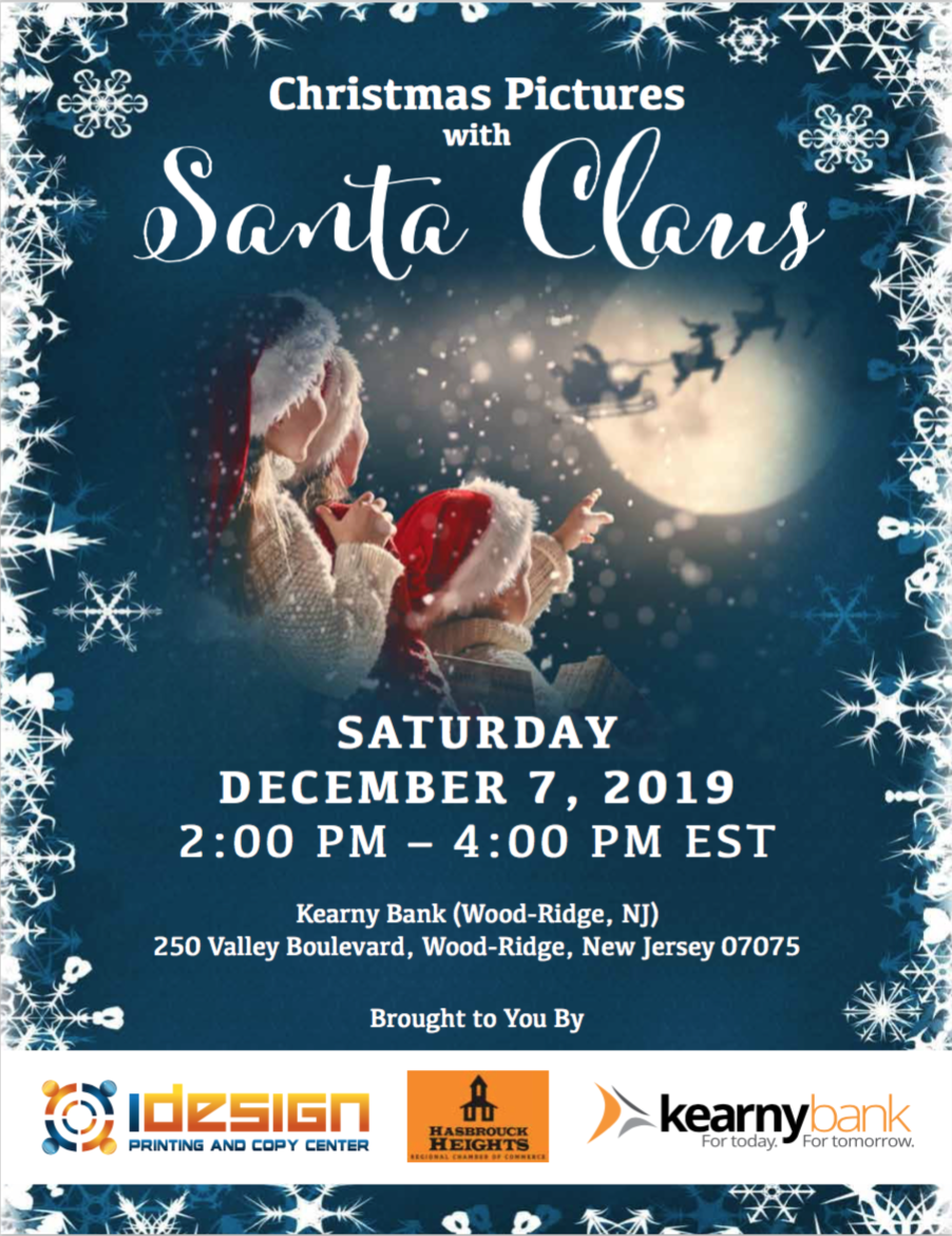
The final project that I worked on this week was for my boss. He and two other businesses were sponsoring pictures with Santa. He gave me full creative freedom to design the poster however I wanted. What is shown below is the final product after only one minor suggestion from my boss. The Image behind the text was entirely created by myself. I chose the blue, I added the snow, and chose the photograph with Santa. I chose to collage them together to create a winter wonderland that is the North Pole.
Week 10
This week was very drawing heavy. I had to design a bunch of different t-shirt designs for multiple organizations. Each of the three clients had no idea what they wanted. I got to be as creative as I wanted, and basically make anything that I thought would go along with what they asked for. It was a lot of fun to think of new ideas for each one, as I got to experiment more than I had gotten to on past projects.
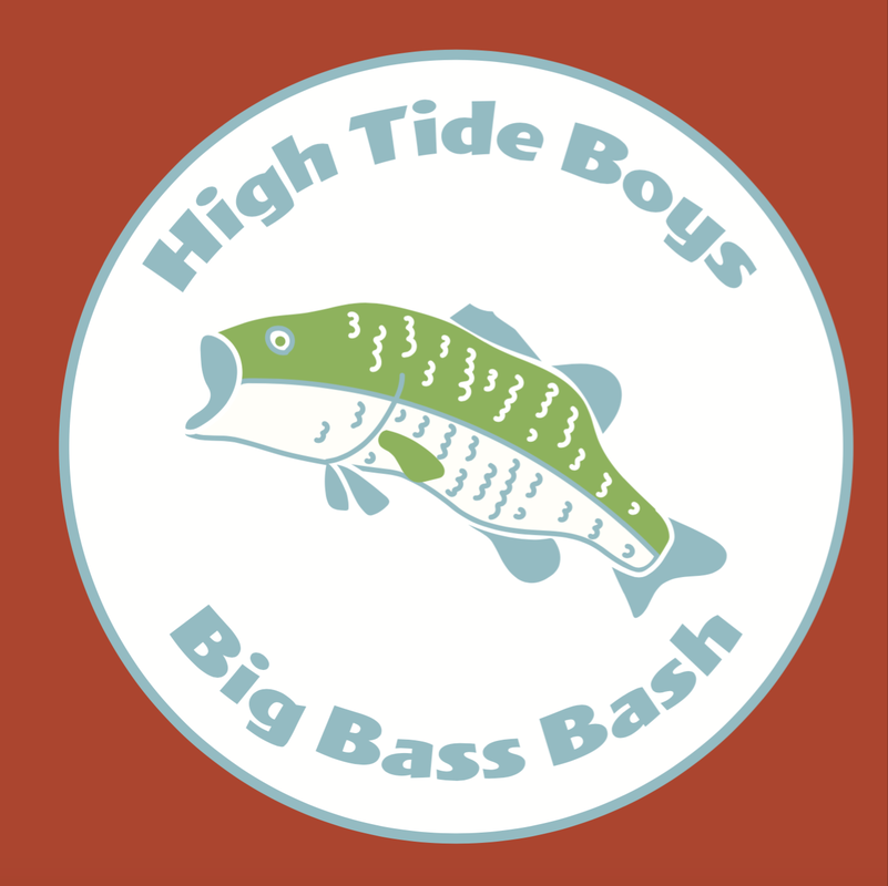
First, I made a t-shirt design for a fishing company bash. It was a client they had had before and they wanted a completely different design than they had in the past. I had not much to go on, the only image of reference they sent along was a picture of fish. They not only loved the idea of having fish in the design, but they loved the colors that were found in the reflections of the scales. The shirt itself was going to be orange, with the design printed onto, therefore my choice of colors had to be complimentary in some way. They also wanted up to three colors in the design which made it easier to play with. The colors I chose were green, blue and white to compliment the orange of the shirt.
At first I began to play with the typefaces that I felt fit the theme of the design. It was a good starting point since they had really no idea or frame f reference to what they wanted the design to look like. I picked big sans serif display fonts that seemed really fun and that would look good printed largely on a t-shirt.


I then began playing with the idea of fish and the ocean to start getting ideas flowing through my head, because having no reference and total freedom of design, I was pretty nervous. I thought puns of some kind would be fun for a big party would be a fun idea since this club was all about having fun fishing with their buddies. They were super laid back, so I wanted the design to be something effortless, but without being too literal on the fish idea.


I then decided to go full fledged into the idea of having the use of a bass in their design. If they wanted fish and are all about fish, lets give them an abstract idea of a fish. These designs are okay, they aren't my favorite, but they helped me get to the final design which is what me and the client were very happy with.


Below is the final design I created, which was by far the best, and was ultimately chosen to be featured on their Bass Bash t-shirts. It takes advantage of the client being willing to use up to three colors, and can also be used as a sticker design. It is much more bright and playful than the others. It embodies what the club is and showcases exactly what they wanted.
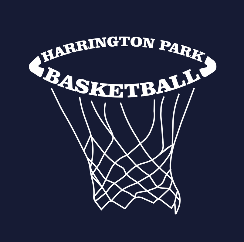
Next I have another t-shirt design. This design was created for the Harrington Park Basketball team. They came to my boss with a need for shirts for the front of their uniforms. They were going to be printed on regular unisex t-shirts with numbers on the back. Their only request was that the shirts be navy blue and the design be in white ink. I was given the task to create a bunch of cool designs to give to them to choose from. I wanted them to say, "Basketball," but I also wanted them to be both well thought out and playful at the same time.
I started off with just text designs. I played with size and typography. Most of my sports uniforms were all text heavy, with little to no images at all. I thought that would be a good place to start even though this is an intramural township team.
I started off with just text designs. I played with size and typography. Most of my sports uniforms were all text heavy, with little to no images at all. I thought that would be a good place to start even though this is an intramural township team.


I then decided that it was time to merge image and typography together in one design. My idea was that the design would be mostly text with some image, giving a hint at the idea of basketball.


Finally I thought that image could be the main component to the shirt and the name be only an accessory to the design. With this in mind I did multiple designs with full basketballs.


The chosen design was the most playful and artistic. It had a sense of individuality and was more of an experiment, rather than a serious design idea that just so happen to turn out really well.
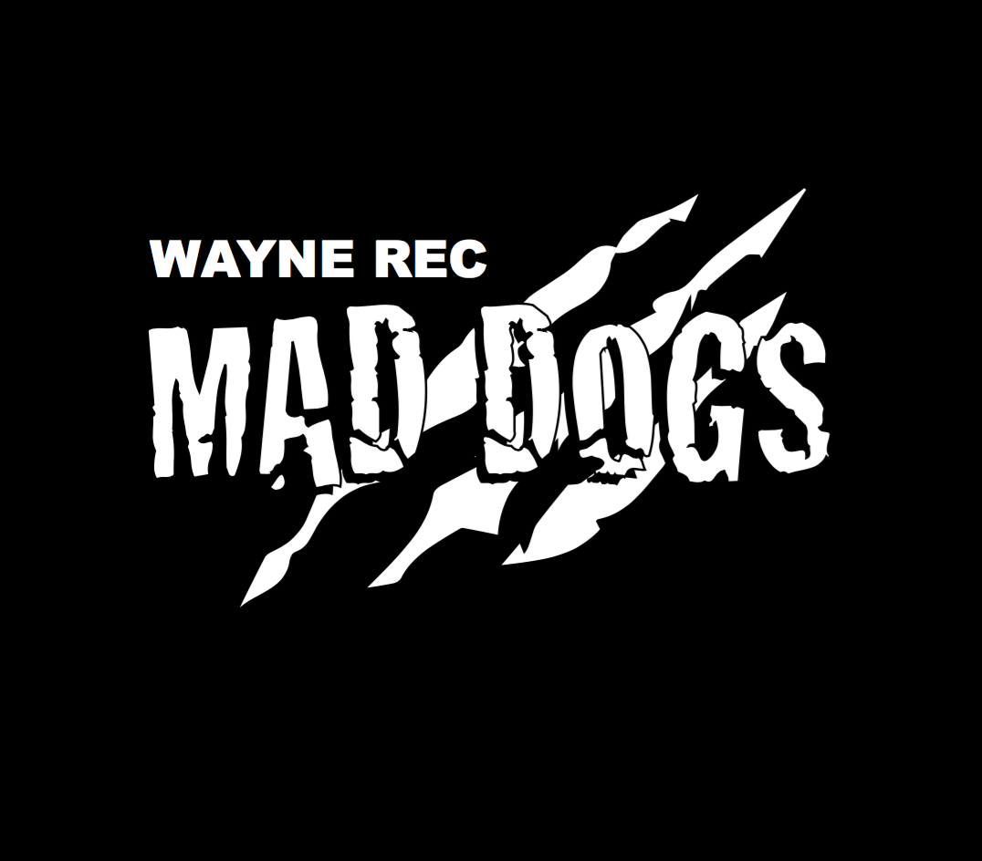
Another project I worked on was for Mad Dogs Volleyball Team. They had shirts made in the past, but they wanted a new design, since the design they had, was about 3 or 4 years old. I was under a lot of pressure, because if they did not love my new designs they would just stick to the old ones. The shirts were black and the design was going to be in white. The first design was a play off of the old one. The old one was much more intricate and detailed, but hard to read and identify certain elements. I simplified it and made it my own design. The next two were simple designs, the middle one was more "wild" like a mad dog would be, and the third was very simple, as the team is for adults. I wanted to stray away from juvenile.


The final design chosen was a play on the mad dog element yet again. I wanted to have bite marks of some kind but it was hard to get that across in a vector drawing, so I went with claw marks. Claw marks are seen all over the world in logos and sports teams, so I felt that it would fit in well here.
Week 11
I worked on a few different project, all completely different from each other. I created banner designs, thank you card designs, and window graphics.
For the window graphics, There were two windows, both different measurements, that a business wanted to create graphics for. I was in charge of create designs both with pictures and without them. I decided to use the same font, color, and style as the logo for the phone number and other text places on the designs. The first was a design for the smaller of the two windows.
For the window graphics, There were two windows, both different measurements, that a business wanted to create graphics for. I was in charge of create designs both with pictures and without them. I decided to use the same font, color, and style as the logo for the phone number and other text places on the designs. The first was a design for the smaller of the two windows.


This was the chosen design for the smaller of the two windows.
Next were the designs for the larger window. The client requested that this window have photographs, painting a picture for potential customers. I chose the images used, the layout, etc. These designs had to match the ones I had created for the smaller window. The pictures I chose, I picked specifically because of their color, used to match the colors in the logo. Tan or relish pictures that matched the design itself looked much more cohesive as a set than photos that were mainly another color like blue or green.


This is the design chosen for the larger window.

This is a banner I was chosen to create for a local beauty salon. After going back and forth with the salon two times, I finally had the correct information to give them real preliminary designs. The only requirements the client asked for was no color. They only wanted black and white, if there was a third color it must be grey. They did not have a logo, so they wanted a pretty script text for their shop name "Luxe", but a play on words with "Be Luxe-urious" to be used.


Below is the chosen design. They loved the idea of dark sophistication. This banner would be hung by two grommets in the top corners in the front of the store.

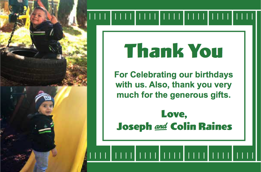
The next thing I worked on during this week was thank you cards for a birthday party for two little boys. The parents had no ideas in mind. They just wanted them to look nice and be able to be sent out later that week. I had one day to create these, and go back and forth with the client and my boss for approval. Below are some of the ideas, in both portrait and landscape. Since they were both wearing football gear, and each had jackets with lime green stripes on them, I thought it would be a cute idea to do a football themed card draft as well.


Here is the final Design that was chosen and printed before the weekend.
Week 12
I was given the task of typing out, formatting, copy fitting, designing, and flowing a news letter for a counseling center. There were pictures given to use to use, names of faculty and their educational accomplishments, etc to format into a small news letter that was to be mailed out to all residents with children and supporters of the establishment. This took quite a while since I had to start from scratch on the entire thing.


Next I worked on a document using NCR paper. There was a mechanic who was creating private contract documents using transfer paper, this way the customer could sign and they would each have a copy to avoid copiers. It is a contract with rules, stipulations, and fees, therefore I am unauthorized to publish it. However, in designing this contract, I was able to learn yet another skill in Indesign. To create a table in Indesign, you create a textbook, with that textbook selected you go to the tabs at the top, click on table, create table, and then select your desired options. You can merge columns together if you need larger areas for certain text, and holding shift and clicking on the column or rows, it will distribute the area evenly.
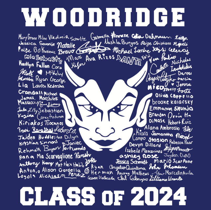
During this week, I also worked on a fun t-shirt idea. Wood Ridge Middle school came to my agency to create t-shirts that featured each student's signature on the shirt. It was up to me to decide how to incorporate all of the signatures in the design in an interesting way. I had to scan in each paper which had 7 signatures on it. Convert them to vectors, and retrace the ones that went over the grid the kids were meant to sign inside. Being that they were 8th graders, many of them did not stay within the size limitations. Below are the two designs I sent to the room parent responsible for getting the t-shirts made.
The first shirt shown is the class year they will be graduating. The number of students they had in the class, could only fill the first two numbers, so I duplicated the same names in the first two and place them in the second. The names that were used in the zero were the same names that were also used to fill the space of the number four. The second design, I used the negative space of their Blue Devils mascot to have the names create its outline. My boss was unsure about the design as I was creating it, but after seeing the end result both my boss and the client were very pleased.


Below shows the final design put into production. Two names of students who were unable to sign their names before the first draft was sent out were also added to the shirt design.
Week 13
I created calendar mail in for "Good Counsel." This is a home for homeless women with infants. Many times these women were kicked out of their houses for getting pregnant and thrown onto the street with nowhere to go. The purpose of this project was to create a calendar for each month for supporters of this organization to mail in checks each month to help keep the project open for more and more mothers. The use of master pages in Indesign was heavily favored for this project. Most projects I did not need master pages for more than outlines, but it was very needed for this project as every other page was the same and the portion above each month was the same. After going back and forth many times with additions and changes, this is the final product of each month. I had to create the layout and input each months information.


I designed the front and back cover for the bundle as well. The picture of the baby was sent to us, as it is a baby of a mother in the program currently.


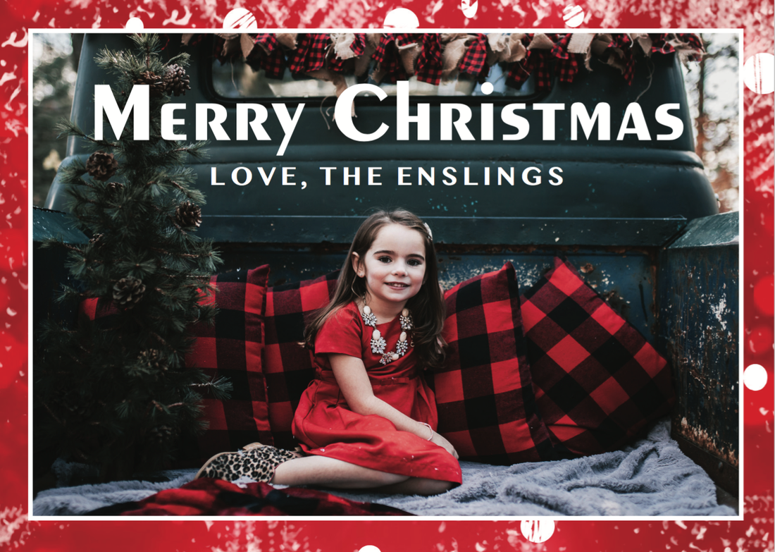
I was given the task of creating Christmas cards for a local family who came into the shop. I designed a red snow collage in the background. I chose the font based on that it looked like a font from a Christmas font. The Client was shown five other fonts and did not like them, so I was able to choose a font of my liking based on her dislikes.


This was the chosen design that was put into production that day and the customer picked up that day.
I created a new design for the Blue Line Beasts company for merchandise. The new logo was based off of a previous design they had before, but they wanted it to be redone. I then had to create a stitch pattern for the hat and photoshop it onto hats to create a mock up for their website to get in orders for the holiday season. The hats were all dark colored, so I made the decision to make the flag white instead of black, and the client responded well to it. Below are the final mock ups that the customer approved.


Week 14
For my final week I had a few tasks left to complete. The first one was very tedious and took a long time. I had to recreate a hand drawn font type digitally in illustrator, This particular client said she wanted the saying below in all red, However, after sending the preview to the client, the client had changed her mind about the t-shirt design. She then decided that she wanted "E.N.D" on the front and "Energy Never Dies," on the back. Being that most of the letters were usable in the remake, I was able to use those, but then I had to create from scratch the other letters. They were going to be printed using vinyl on a black t-shirt.


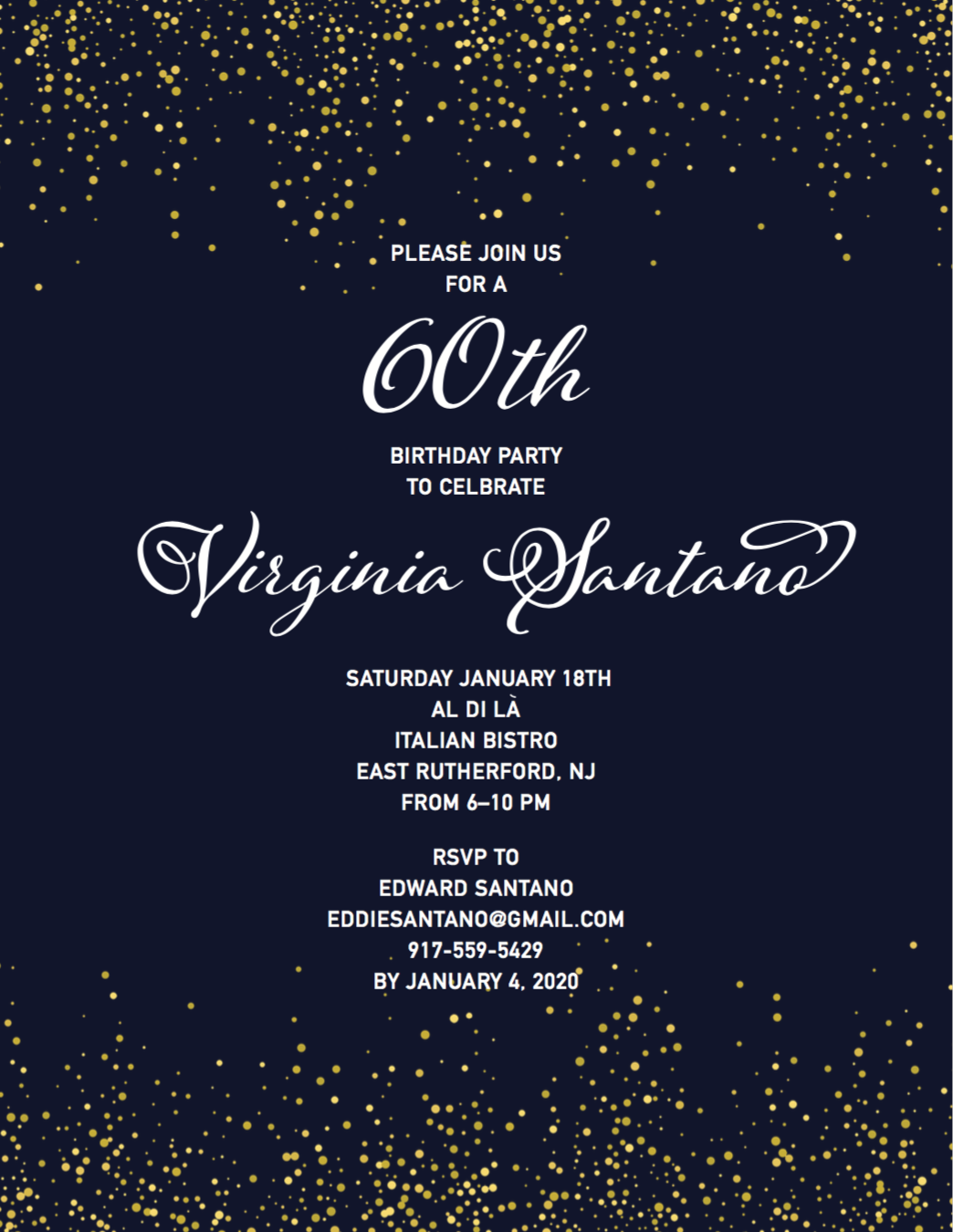
I I had to create a 60th birthday party invitation. They were specific with wanting the name and age in a different font from the rest. The background color they wanted to be black or navy blue. I decided navy was a bit more festive, and added the champagne bubbles to the top and bottom as it is a glorious celebration for a big milestone. I chose the typefaces used and believe that they compliment each other quite well. This is the final product.
I had to create multiple template for last minute Christmas cards for anyone that came into the shop. I stuck with the colors red and green, but I thought it would be fun to create designs that were slightly more dynamic in that they had different shades of those stereotypical Christmas colors. Each design had its own style, therefore having four designs appealing to many different people. It was important that they all be different.


Conclusion
Over all, I am very happy with all of the work I had done, and with all that I learned. I learned all of the different outputs for production, for when I go into my chosen career in advertising. I think that this was a very good learning experience for me. I learned how to function in a work environment with different people and how to deal with client demands. I'm grateful for my experience, but I'm excited for my future to move forward.
